
本サイトにはアフィリエイト広告が含まれることがあります。
King & Prince とぽぽぽ組(平野紫耀・岸優太・神宮寺勇太)関連の最新情報
#Number_i_GOAT きましたね!
ルイ・ヴィトンのショーのダミエ(スーツ)、Greatest of All Time!はこの伏線だったのかという感じ。
10/15 18:30にはTOBEから緊急発表があり、やはり岸くんがTOBEに合流でした!平野紫耀、神宮寺勇太、岸優太の3人で活動していくとのこと。
彼ら自身でどのように語っているかを大切にしたいので、文字起こししてみました。
彼らの言葉を直接受け取りたい方は、NUMBER_i(元キンプリ平野&神宮寺勇太&岸優太)10月15日緊急ライブ トーク全文 >> を見てみてください。
グループ名は「NUMBER_i」(ナンバーアイ)。
岸くんのX(Twitter)はこちら↓
フォローありがとうございまーす!!!!
仕事なう!!!!
— 岸優太 (@_yuta_kishi_) October 16, 2023
NUMBER_iのYouTubeはこちらです。
平野紫耀、神宮寺勇太、岸優太はNumber_iを結成いたします。https://t.co/cvcLN4YHXJ#Number_i pic.twitter.com/dxgDHqcMRe
— TOBE OFFICIAL (@tobeofficial_jp) October 15, 2023
#Number_i pic.twitter.com/e8hTKRaP1X
— TOBE OFFICIAL (@tobeofficial_jp) October 15, 2023
グループ名の案を出したという岸くんの言葉は次のような感じ。
「何よりも1番を目指す…1番を目指すことは大切なことですけど、やっぱりそれ以上に大切なのって道筋だと思うんですよ。僕たちらしく、どう輝けるか、楽しめるか。その中でファンの人たちとどれだけ一緒に楽しめるのか…っていうのが“i”の一つ。オンリーワンに掛けて。まあ粋なアイデアみたいな感じだす(笑い)。引きで見たらナンバーワン、オンリーワン。それに今、ジャストアイデアで“i”ってラブの方の“アイ”にもなるしね」
平野くんも次のように。
「どんなグループになっていくんだろう、Number_i。探り探りだけれども、いい意味でも悪い意味でも何か失敗した姿も見せていいと思うだよね。ファンの皆さんと苦楽を共にしていきたい。泥臭い俺たちも見てもらいたいな」
「動画を観るのは時間がかかる!」文字で読む方が早い方向けに、トークをすべて文字起こししました。
ファンと一緒に苦楽を共にして、過程を過ごしていくとも言っていました。うれしいですね~
NUMBER_Inのファンクラブの申し込みも20時から開始されました。
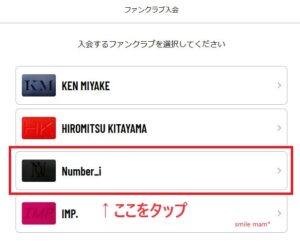
手順については、下の記事を参考にしてください。
TOBE 平野紫耀&神宮寺勇太のFC会員やメルマガ登録の会費は?登録はどこから?登録方法を画面つきで解説 >>
15日の配信は、配信前のカウントダウンが始まったときから、たった70秒で、10万人以上が視聴。
3分で22万人以上!4分で243000人、5分で37万6000人、6分で41万9000人、7分で53万1000人…すごい注目度でした。
15日の発表と岸くんの今後のことがわかり次第、また追記します。
会員登録、インスタアカウントについての記事は、こちら↓
元King & Princeの平野紫耀・神宮寺勇太の新曲発売はいつ?滝沢秀明プロデュースのTUBEから
TOBE 平野&神宮寺のFC会員やメルマガ登録の会費は?登録はどこから?登録方法を画面つきで解説 >>
TOBE 平野と神宮寺のインスタアカウントはどれ?フォローできない問題の解決方法は?
TOBEのオフィシャルをかたるTwitterアカウント
このアカウントは私達に一ミリも関係はございません!お気をつけて🫡 https://t.co/WW7inVMQXb
— Hideaki Takizawa 滝沢秀明 (@h_Takizawa329) July 7, 2023
キンプリの新アルバム『ピース』 の発売日は?先着特典A新着特典Bと通常版の内容も
キンプリの新アルバム『ピース』 の発売日は8/16(水)
【早期購入特典】
初回限定盤A 特典:フォトカード(A6サイズ)
初回限定盤B 特典:クリアポスター(A4サイズ)
通常盤(初回プレス) 特典:5周年ロゴスタンプ
【初回限定盤A】(CD+DVD)
仕様:三方背ケース付2Dケース、フォトブックレット24P、歌詞ブックレット20P
■初回封入特典 期間限定動画 A 視聴シリアルナンバー
※視聴期間:2023年8月15日(火) 昼12:00~8月29日(火)18:00まで
【初回限定盤B】(CD+DVD)
仕様:三方背ケース付2Dケース 、フォトブックレット24P、歌詞ブックレット20P
■初回封入特典 期間限定動画 B視聴シリアルナンバー
※視聴期間:2023年8月15日(火) 昼12:00~8月29日(火)18:00まで
【通常盤(初回プレス)】(CD)
仕様:3Pケース、歌詞ブックレット20P、ソロアナザージャケット2種セット封入
■初回封入特典 期間限定動画 C 視聴シリアルナンバー
※視聴期間:2023年8月15日(火) 昼12:00~8月29日(火)18:00まで

King & Prince LIVE TOUR 2023 ~ピース~の申込締切日は何日?ライブの場所と日時も
King & Prince LIVE TOUR 2023 ~ピース~ 7/3から申込受付が開始されましたね。
宮城 セキスイハイムスーパーアリーナ
8/27(日)
北海道 真駒内セキスイハイムアイスアリーナ
9/30(土)~10/1(日)
福岡 マリンメッセ福岡A館
10/10(火)~10/11(水)
神奈川 Kアリーナ横浜
10/20(金)~10/22(日)
新潟 朱鷺メッセ 新潟コンベンションセンター
10/28(土)~10/29(日)
大阪 Asueアリーナ大阪(大阪市中央体育館)
12/1(金)~12/3(日)
愛知 Aichi Sky Expo(愛知県国際展示場)Aホール
12/9(土)~12/10(日)
King & Prince LIVE TOUR 2023 ~ピース~の申込締切日は
King & Prince LIVE TOUR 2023 ~ピース~の申込締切日は7/10(月)11:00まで
King & Prince LIVE TOUR 2023 ~ピース~の申込方法は?
会員サイトから申し込むことができます。
元King & Princeの平野紫耀くんの新曲はどんな曲?作曲家は?
平野紫耀さんの新曲のプロジェクトは極秘裏に進められているということで、まだあまり情報がありません。
ただ、プロデューサーは滝沢秀明さん。
作曲家はこれまでに数多くの有名アーティストに作品を提供してきた有名な方のよう。
大物の作曲家の方の作品となれば、その作曲家の方のファンも耳にするでしょうし、業界からも注目されそうですね。
滝沢秀明の芸能事務所TOBEは何と読む?読み方が知りたい
ジャニーズ事務所副社長を退任した滝沢秀明が立ち上げた芸能事務所には、元V6の三宅健、元King & Princeの平野紫耀、IMPACTorsなどが合流すると話題になっていますね。
ところで「TOBE」は何と読むのでしょう?
チューブ?のようにも思えますが正しくはトゥービー。
BEは英語の「be」だとすれば、~である、~になる、~へ。
「#TOBE新たな時代へ」というタグも使っていましたね。
「To be continued」の一部をとっているようでもあり、「飛べ」とも読めます。
未来に向けて、飛躍して何らかの状態になっていく、~である(彼ららしくある?)…という雰囲気を感じる、いい名前!
…と思っていたところ「To be, or not to be」からとのことですね。
「間違ったっていい、自分の意思の示す方に行く。躊躇してる暇はない、何も持たなくてもいい、1人でも闘う」と。
何かあっても自分が全て背負うって、カッコいいですね~!
King & Prince「I promise」Music Video -Story ver.-予告編
キンプリのMV・出演番組/ドラマ/映画/カレンダーのロケ地と行き方
キンプリの「I promise」ジャケ写のロケ地はどこ?アクセスや住所もチェック! >>
キンプリのMVや出演番組/ドラマ/映画/カレンダーのロケ地と行き方まとめ >>
